Heritage Books
Heritage Books. That phrase may mean something to those of you of a certain age, who like me can remember when Wonder Bread was health food (“Helps build strong bodies 12 ways!”). Back then there were Heritage Books, and we had a whole bookcase full of them.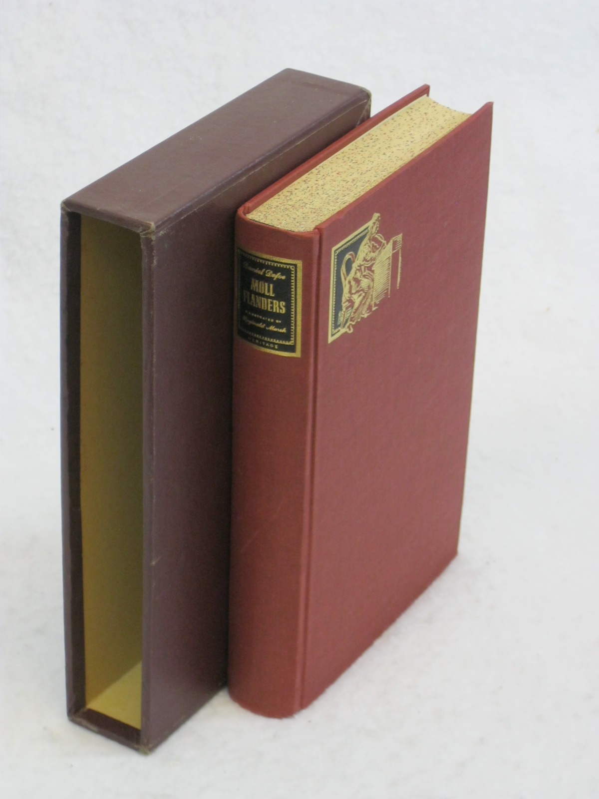
These weren’t just books, they were Books. All hardcover, of course, but there was more to them, much more. Each one had been carefully designed to be a beautiful and inviting embodiment of one classic work of literature. They had Size. And Weight.
Not that they were big for the sake of being big, like some giant, glossy offering that would work better as an actual coffee table than a reading experience. They were well balanced and easy to handle. Many were smaller than an 8 1/2 by 11 piece of paper, though they were usually quite thick (most classics are pretty long, after all).
They had substance. Just picking one up, feeling its solidity, you knew you were about to enjoy something wonderful.
Delicious Design
Unlike most hardcovers, they didn’t have dust jackets—they had slipcases. Holding that case in your hands, gently sliding the book out, was like opening a treasure chest, because you never knew quite what to expect, but you knew it was going to be special. The cover design, the endpapers, the illustrations, the very typeface had been specifically chosen to complement this one book, to present the author’s words to you as carefully as a master jeweler creates a setting for an exquisite gem. [And you knew all this because the people at Heritage Press would helpfully explain the choices to you, in the introduction or afterword or the “Sandglass” newsletter that my father always tucked inside the front cover.]
I only remember a few specifics. Picasso was commissioned to do the drawings for Lysistrata. The words on the spine of Moll Flanders were stamped in metal, but in copper (rather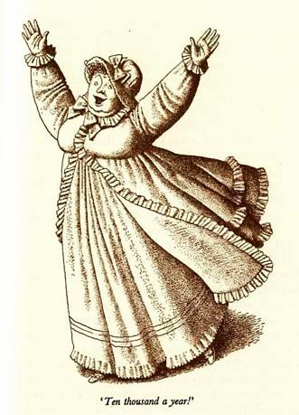 than the more usual gold) because copper tarnishes (or mellows with age, depending on your perspective), which seemed a good match for the lady’s career. Pride and Prejudice was perfectly illustrated with warm yet slightly acid sketches that poked more-or-less gentle fun at all the characters (by artist Helen Sewell).
Everything about a Heritage Book was designed to increase the pleasure of reading it. Sewn bindings (of course), thick, smooth paper with an easy-on-the-eyes creaminess, the entire volume a solid size and weight but never too big or too heavy.
Easy to handle. Lovely to touch. Sit down, it whispers. Open me. Spend some time. You won’t regret it.